Tuesday, 7 June 2011

FdA Fine Art degree show- Gloucester building- 2nd-7th June 2011


My sculptures Brainwasher, Mother and Daughter, The Struggle of Being a Mother and Artist, Female Peg and Milky Boobs and a collection of drawings about my experiences of childbirth and motherhood have been exhibited in this show that me and my talented classmates have put together to close this exceptional year.

The show has been based in Gloucester building with a real variety of works displayed on the ground floor, mezzanine and the upstairs floor. From painting to installation and from sculpture to drawing the show in my opinion has been very successful and communicates well our levels of artistic development.

I received positive comments from the work I have exhibited here, specially from Female Peg with people saying that it was simple but very effective, with someone even daring to say that she could imagine a piece like that hanging on a major art gallery like Saatchy, which I thought it was quite a nice compliment and it  encouraged me to aim higher.

My final piece Brainwasher has been also acclaimed by the public attending the exhibition, qualifying it as funny, original and powerful. Even if I could not managed to make the object to move at the end, having the cable attached to it and plugged into the wall has provoke a lot of thoughts and reactions. I have encountered problems when looking for mechanisms to make it move and I have learned that for future work I should focus first on the technical side of the piece (if required) and then work with the rest so dissapointment can be drastically avoid, specially when a piece is created to be exhibited in a public show.

Painting the exhibitions spaces allocated to display my work white was something intuitive, I felt that the work needed to stand out in the space and it will looked good against white walls and floor. However whilst I was painting the floor I did not think off whether I wanted people to walk around in the spaces or not and after finishing I had to make the decision, which it was people would be allowed to walk around despite leaving foot prints all over the place and ending with the inmaculate feel of it. Someone suggested that I could closed the spaces with a strip of wood at the bottom as a sign of no entry to the viewers and leave the work as an installation to be looked at from outside. However, in the event of doing this the appreciation of the work would have been very different from how the work is expressively designed to engage with the viewer. My work needs to be confronted, looked at from the front, like when you grab a bull by its horns or which is equal to the English idiomatic expression of graspping the nettle. I have learned that there is always something new to learn in each exhibition that you get involved, I think years of experience on setting shows will provide me with the skill of getting everything right considering all aspects of the work and its environment, but at the moment is all about experimenting and seeing what works for me and my work.

In the private view I felt confident about my work, from my experience in Vyner Street Gallery the previous month, I have learned that the work despite being finished in appareance it is never finished without convincing people of the ideas behind the work and to lead them to a way of connecting with the work in the same way that you do. For the first time I was proud of my work, I really needed to believe in it and to take this positive attitude onto my next course. I believe the more I talk about it the better I get getting the meanings across.



Wednesday, 25 May 2011

Nancy Spero - Serpetine Gallery 3 March - 2 May 2011

GL%207872%20-%20Female%20Bomb%20press%20page[1]-365.jpg

Nancy Spero
Female Bomb 1966n

Nancy Spero. Protests made through drawings and prints. I thought the works were very repetitive, the quality of the drawings were almost the same in each one, which it is not a bad thing but it was kind of boring after being in the exhibition for a while. What I really enjoyed from this exhibition was the way that the drawings were displayed onto the wall, like a big protest banner and the quality and oakcolour of the frames. All the pieces worked really well together, I enjoyed the colourful drawings and its lively but also painful expression. Taking into account the quality of Nancy Spero's work she appeared to be a very passionate female artist that she used her art as a political statement against war, male dominance and abuses of power.

Transfers, Angela de la Cruz at Lisson Gallery until 30 April 2011

Compressed (cream)2011 Oil on aluminum 122 x 70 x 56 cm

There is somethings about Angela de la Cruz's work that I really like. The main reason might be that, like me, she uses her own personal experiences to create row and fiercely emotive artwork, also her use of bold colours in  the destroyed canvases she presented when shortlisted in this year Turner Prize were very graphical and aesthetically beautiful.

I am not sure whether I like this artist for the mere fact that she is Spanish and had achieved so much in current contemporary art in this country or because I really like her work. Either way she has inspired me this year and has set new goals for me to achieve. Her work is fun but aggressive at the same time, raw but methodical in the way it has been created and later on destroyed.

I read in the title of this show "Transfers" as the period  when she had a stroke and left her in a wheel chair. Transferring her from the bed to the wheel chair, from the wheel chair to the bath and so on... 

Angela de la Cruz, Transfer (ivory), 2011
I particularly like this work called Transfer (Ivory), for me represents the artist sited in a sofa with her lower body parts paralysed resting her legs on a chair.

Modern British Sculpture - Royal Academy of Arts - 22nd January-7th April

Anthony Caro's sculpture , Early One Morning, 1962, part of a new 
show of modern British sculpture which runs at the Royal Academy of Arts
 in Piccadilly.
Anthony Caro, Early One Morning, 1962,
I was particularly interested in seeing this exhibition since I made the decision of going into the second year of the BA Sculpture course next academic year.

I was quite impressed by the works in this exhibition, mostly with the works of Barbara Hepworth, Henry Moore and Anthony Caro. Not sure why a film by Len Lye was at the exhibition and was categorized as sculputre, perhaps for its elasticity of the drawn forms onto the film? However to see something that actually moved distracted me from all the other stationary works. Henry Moore's Reclining Figure was absolutely stunning and made me think of the female figures painted by Picasso, i.e those of Madamoiselles d'Avignon. The hollows spaces of the figure, the sensual shapes of the figure reminds me of a rolling hills landscape. Every single angle offered me with a new perspective , the figure was always evolving although was still the same once your eyes were far enough to contemplate the sculpture in a whole. Barbara Hepworth was also quite inspiring, very similar to Henry Moore, magnificient pieces of work on marble and stone. Anthony Caro's Early One Morning was for me the best piece on the show, it was free, airy and fresh despite being so old,  only a different viewpoint, as in the work of Henry Moore, was just needed to enjoy this work, the work unfolded and expanded into the spectator's space . The zinging orange against the grey colours of the floor made it even more stand up and more effective graphically. Regarding the simple forms and the simplicity of this piece in general I would say that, less is more and Anthony Caro has achieved this in this piece.

I neither enjoyed the early 20th century sculputure at the beginning of the show but either the more contemporary sculputures at the end, like the work of Damien Hirst, which I thought that killing flies in front of people was really savage, I did not see this work as a work of sculputure, perhaps more of a performance.

It was good to see some much "called" sculputure, it did help me to locate my work and understood the possibilities of sculputure. However I did not see any 3D work made out of fabric, most materials were hard as marble, stone, steel, etc... and this made me wondered whether the art world still rejecting needlework as artwork itself and still be categorized as craft. Something what I have also noticed is the little work by female sculptors in the show.  This excentric exhibition had some controversy for not including work from Antony Gormley and Anish Kapoor, but what about the women? Is this really representative of the current state of British sculpture?

Thursday, 3 March 2011

Whenever I mention the word motherhood I can feel my voice tone lowering

Hi,
Hi,
How can I help you?
Flat white please
Are you enjoyning the sun today?
Not really, I'm at home writing an essay
Oh that's not fun, what is it about?
Errrr... (my voice trembles, my heart beat raises, I feel insecure, I have to say that word again)
Motherhood and art... (in that moment the doors opens making some noise that luckily weaves with my voice)
Sorry? - the coffe guy says
Errrr.... ART  (I ended up saying with a smile on my face)
Oh you've got me there, he says
£2.10 please
Thank you
Bye bye

Left the coffee shop feeling quite angry with myself for not having had the courage to say the word "motherhood" with confidence and proud.

This is going to be harder than I thought.

Thursday, 20 January 2011

Artist Eti Wade discusses "The Maternal Gaze" at The Front Room Gallery, Troikay Editions, London 13th January 2011

Eti Wade
Good Night Boys by Eti Wade

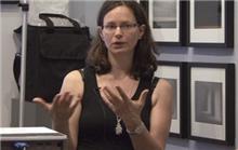
Some of the mothers artist that attended to the talk, me on the left hand side corner bitting my nails.


Eti Wade is an artist, photography lecturer and head of the Photography MA at Thames Valley University.

This event was organized in conjunction with artist Martina Mullaney, founder of Enemies of Good Art. Enemies of Good Art is a group which seeks to investigate the possibilities of combining parenthood and the artistic practise. In particular it seeks to encourage participation by parents and their children in a series of public discussions and art based events.

The subject of the dicussion was mothers photographing their children and why being this an everyday occurrence it is not often that the maternal view is put on display. In her talk Eti surveyed the exposing mother, from Lady Clementina Hawarden to Sally Mann, to identify common themes and suggest interpretations of the social unease accompanying the maternal gaze.

As a conclusion on this talk I have to say:
Many women artists like to get their children involved in the artwork and many of the times the children are portrayed in the actual piece. Everything Eta said about the difficult feelings about the maternal made sense to me, however I think our children do not have necessarily to be the artwork or appear on it. The "unfair" representation of the mother in society it is something that we mothers have to deal with it, I don't think our children needs to be part of it, I can't say never but I'm not happy with the idea of putting my daughter in the scene when representing my feelings. My daughter is intimately mine but clearly her own self as well.  I can't use her as way to understand myself, it will not be fair on her.

Monday, 17 January 2011

Rachel Whiteread - Drawings - TATE BRITAIN 8 Sept 2010 - 16 January 2011

  "My drawings are a diary of my work" Rachel Whiteread

Untitled..Double Mattress Yellow (1991) by Rachel Whiteread

This is the first museum retrospective of Rachel Whiteread drawings. Again drawing invites the viewer to see a private realm of the artist's thoughts.

This exhibition is comprised by drawings on paper, collages and a collection of objects.

The drawings reminds me to the drawings of a  draughtsman. Sensitive lines and loose spontaneity are traced on coloured graph paper and tracing paper. For the artist the nature of the paper are very much part of the drawing
itself. 


All of them has a very plain and minimalist feel, there are not vibrant colours, instead there are some touches of soft colours acrylic paint, correction fluid, ink and resin skilfully applied to them.

These drawings of tables, chairs, floors, beds and mattresses, baths and slabs, houses, rooms, stairs, doors, windows and switches, torsos and heads makes me reflect in the artist interest or inspiration from quotidian things used by us human beings, elements of our everyday life that we usually take by granted.

Looking at her drawings makes you think in her sculptures, these studies or thoughts are as sculptural as their sculptures are graphic. Her drawings impart tremendous skill and sensitivity.

I see the artist as a collector of images. Approaches as collage, old postcards, found objects seem to be an important part of the artist's creative process.

I have choose to see her work because it is very different to what I do. From my own point of view her work is almost too cold and structural. It is very minimalist and secretive, it doesn't give much away, and I think this is what I like about Whiteread's work. There is no text in her work, there is not a necessity to explain anything. I sometimes felt confronted by these drawings, they were almost too clever and confident.

I felt that perhaps I should not draw in such a figurative way and maybe I should be more abstract when drawing on paper. I feel that in my work I give to many clues to the viewer, I'm not sure whether the use of text or better said "too descriptive" text makes my work boring or not engaging enough.

Study for "Village"-1st, 2004
Ink, pencil, and collage on paper
(29.9 x 41.1 cm)


Some of the artist's objects collection